Download the presentation of this section.
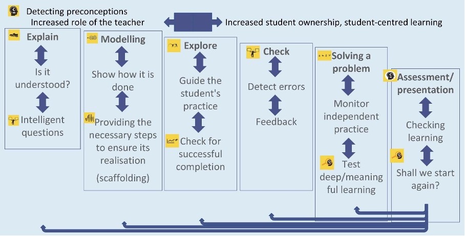
Rosenshine’s Principles enhance the point of view of the students by constantly assessing if the students understand concepts using new activities, in our case we are using ArcGIS Online. Teacher needs to monitor the students’ work. All the steps have been seen in previous modules and we have summarised here:
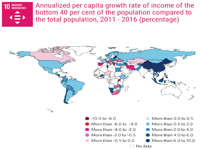
The case study entitled Economic Inequalities in the Word is used to visualise the word inequalities and disparities. Sustainable Development Goal number 10 works to reduce inequalities.
Each person is different and lives in different circumstances and does not have exactly the same opportunities, thus equity tries to add other chances in order to achieve an equal outcome.
The first question for a teacher is to determine the key objectives for students learning in the curriculum framework linking with real-life. For this case study, we will focus on:
-
- Observe economic inequalities in the world with the aim to see how it would be possible to reduce them.
- Define and describe indicators related to inequalities.
- Interpret the same indicators mapped in different viewers.
- Explain how changing the intervals on a map can contribute to providing different results using the same data (critical thinking)
- Linking to SDGs numbers 8, 9 and 10.
The first step is to detect preconceptions using an activity with some key questions which should be the same at the beginning and at the end, in order to have evidence of the students’ improvement. In this case, a Kahoot has been used.
Explanation
There are different indicators to measure economical inequalities and ways to explore how to reduce them:
-
- The UN indicator: annual per capita growth rate of income of the bottom 40% of the population compared to the total population. It has been used since 2011 to 2016 in percentages and the SDGs report has created this map for 2019.
- The AROPE rate/ indicator At Risk Of Poverty and/or Exclusion, modified in 2021. https://ec.europa.eu/eurostat/statistics-explained/index.php?title=Glossary:At_risk_of_poverty_or_social_exclusion_(AROPE)#:~:text=At%20risk%20of%20poverty%20or%20social%20exclusion%2C%20abbreviated%20as%20AROPE,a%20very%20low%20work%20intensity.
- Annual average growth rate in per capita real survey mean consumption or income, bottom 40% of population (%), only available for the countries with high level of poverty. https://data.worldbank.org/indicator/SI.SPR.PC40.ZG?view=map
- Gross Domestic Product (GDP) based on purchasing-power-parity (PPP) per capita (2016 IMF) https://arcg.is/1qinaSThe concept of PPP is explained here: https://www.imf.org/external/pubs/ft/weo/faq.htm#q4d
- The UN indicator: annual per capita growth rate of income of the bottom 40% of the population compared to the total population. It has been used since 2011 to 2016 in percentages and the SDGs report has created this map for 2019.
It is possible to add other concepts such as Gini coefficient or the unemployment rate.
Asking key questions will improve observation and inviting to explore maps and data. Students’ scientific curiosity will improve in this way.
Modelling, if you change intervals on a map, the reality seems very different with the same data. Thus, critical thinking makes it possible. The online maps applications allow us to do it quickly (on the fly).
 |
 |
| Four intervals, many countries seem the same. | Eight intervals. Differences between countries are clear. |
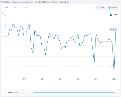
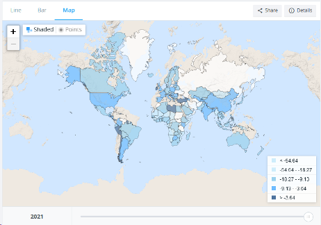
You can also see a graphic and a map for each year.
 |
 |
| GDP changes from 1961 to 2020 (annual %) Source: World Bank. https://data.worldbank.org/indicator/NY.GDP.MKTP.KD.ZG?view=chart |
Changes in GDP per capita in 2020 (%). Source: World Bank: World Bank. https://data.worldbank.org/indicator/NY.GDP.PCAP.KD.ZG?end=2020&start=1961&view=map |
Explore data guiding student practice (using the previous scaffolding, students acquire knowledge about layers and concepts)
- Search on ArcGIS Online other data layers and indicators (see Step 3), such as the Gini Coefficient or the Ecological Footprint:
-
- “Continued_economic_growth” from zwarti, which uses the Gini Coefficient.
- Ecological Footprint by AlejandroPeq, which contains the Ecological Footprint.
Try to find other layers with indicators related to inequalities in the world, such as the Human Development Index (HDI) (if you don’t know what HDI is you can watch the following video for GCSE https://www.youtube.com/watch?v=IElJbtTYtuM and for Higher Education those: http://hdr.undp.org/en/content/human-development-index-hdi or https://youtu.be/HwgZQ1DqG3w
2. You can change the intervals of the maps by following this example:
-
- – Go to the link: https://arcg.is/1qinaS, which contains the map with the Gross Domestic Product (GDP) per capita data in current international dollars, purchasing power parity (PPP) (2016) (Source: International Monetary Fund).
- – Log in to your ArcGIS Online account and save it as a new map.
- – Go to Change style
- – Select Drawing style
- – Classify data: quantile, standard deviation, equal interval, natural breaks, manual (see concept section at the end of the document) .
- – Select the method and number of classes or intervals to divide the data into.
- – It is possible to round the classes using the manual method.
- – Observe the result, look for patterns and review the questions studied.
You can follow the steps here: https://youtu.be/wxOK7F38JNg
You can also change the intervals in QGIS: https://youtu.be/9l3P0LFMbwM
Note that the distance between numerical data takes on different meanings depending on the interval chosen and that you should know how each interval works: equal intervals, quantiles, Jenks natural breaks and standard deviation (more info: https://pro.arcgis.com/en/pro-app/latest/help/mapping/layer-properties/data-classification-methods.htm)
Check for successful completion and detect errors to correct
Learning outcomes can be seen using an essay or a short dissertation on the topic or writing the impressions after working with concepts, graphs, map layers and intervals.
Problem-solving
The main problem is to look for alternatives to reduce economic disparities in the world. It is not an easy task, thus students need to reflect and to use their knowledge related to the equity concept.
This case study is available here: